First, include it on your page
Add the CSS on your page:
<link rel="stylesheet" type="text/css" href="http://yui.yahooapis.com/gallery-2013.01.09-23-24/build/gallerycss-cssextras/gallerycss-cssextras.css">
Optionally, you can load it through the YUI().use():
  YUI({
    //specify a gallery build
    gallery: 'gallery-2013.01.09-23-24'
  }).use(gallerycss-cssextras', function(Y) {
    Y.log('YUI Loaded');
  });
Images
Styling of three different types are available for images, eliptical, rounded, bordered.
To use them, just add one of these classes to the <img> tag
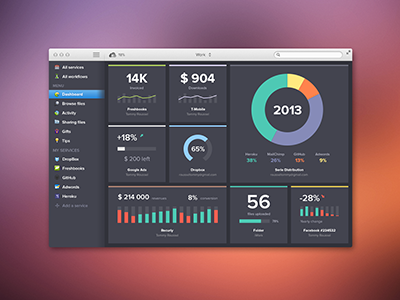


When using class yui3-img-eliptical, if the width and height of the image
are equal, it will appear as a circle.

Thumbnails
Add the class yui3-thumbnails to the container <ul>,
Then add one of the classes, yui3-thumb-eliptical, yui3-thumb-rounded, or yui3-thumb-bordered, to the <a>,
.
Adding a <div class="caption"> allows you to customize the thumbnail with additional content.
if you have YUI grids on the page, add yui3-u-* for multi-column thumbnails that scale to fit the columns.
-
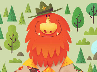
-

-

Thumbnail label
Curabitur et sapien ac diam pharetra lacinia quis ac tortor. Suspendisse dictum fermentum dui at mollis. Nunc pulvinar blandit diam in vehicula.
Code
Designate text as being code as in this example...
example: When using a<div> make sure to...
To show a block of code, wrap it in a <pre>...</pre> tag.
for (i = 0; i < 10; i+=1) {
    myValue = i;
}
Badges/Pills
To create a badge/pill, use a <span> tag, and add one of the badge classes as shown below
Notifications
Create notifications by adding a class to it's <div>,
Contextual Modals
Bottom Arrow
You have no new notifications.
Receive notifications when you comment or discuss content with friends on Yahoo!
Left Arrow
You have no new notifications.
Receive notifications when you comment or discuss content with friends on Yahoo!
Top Arrow
You have no new notifications.
Receive notifications when you comment or discuss content with friends on Yahoo!
Right Arrow
You have no new notifications.
Receive notifications when you comment or discuss content with friends on Yahoo!
Contextual Modals with Grids
You can use grids within these contextual menus for interesting effects.
You have mail.
Multiple Notification Sources.
Buttons
Buttons are provided through cssbutton. Attach the .primary or .error class names to toggle styles.
Large Button
Large buttons have twice the padding of regular buttons. Apply the .large class name.
Small Buttons
Small buttons have half the padding of regular buttons. Apply the .small class name.
Tooltips
Tooltip markup is identical to popover markup, but can be triggered off title attributes.
